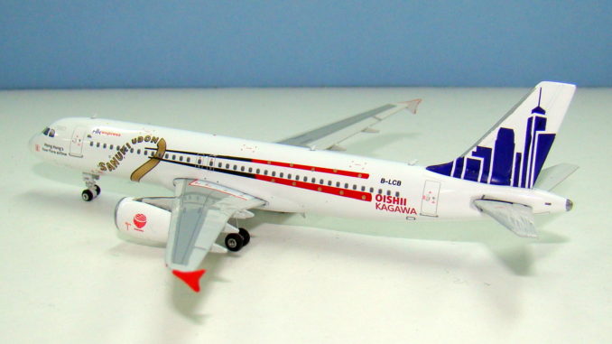
The international aviation scene is nowadays awash with both special liveries and low cost carriers, however few of the liveries are asymmetric and few of the LCCs are particularly classy. HK Express has transformed into a low cost airline in recent years but one that has a certain panache, whilst their latest special livery represents good business and friendship. So it’s kon’nichiwa to this Phoenix models A320 of B-LCB.
THE REAL THING
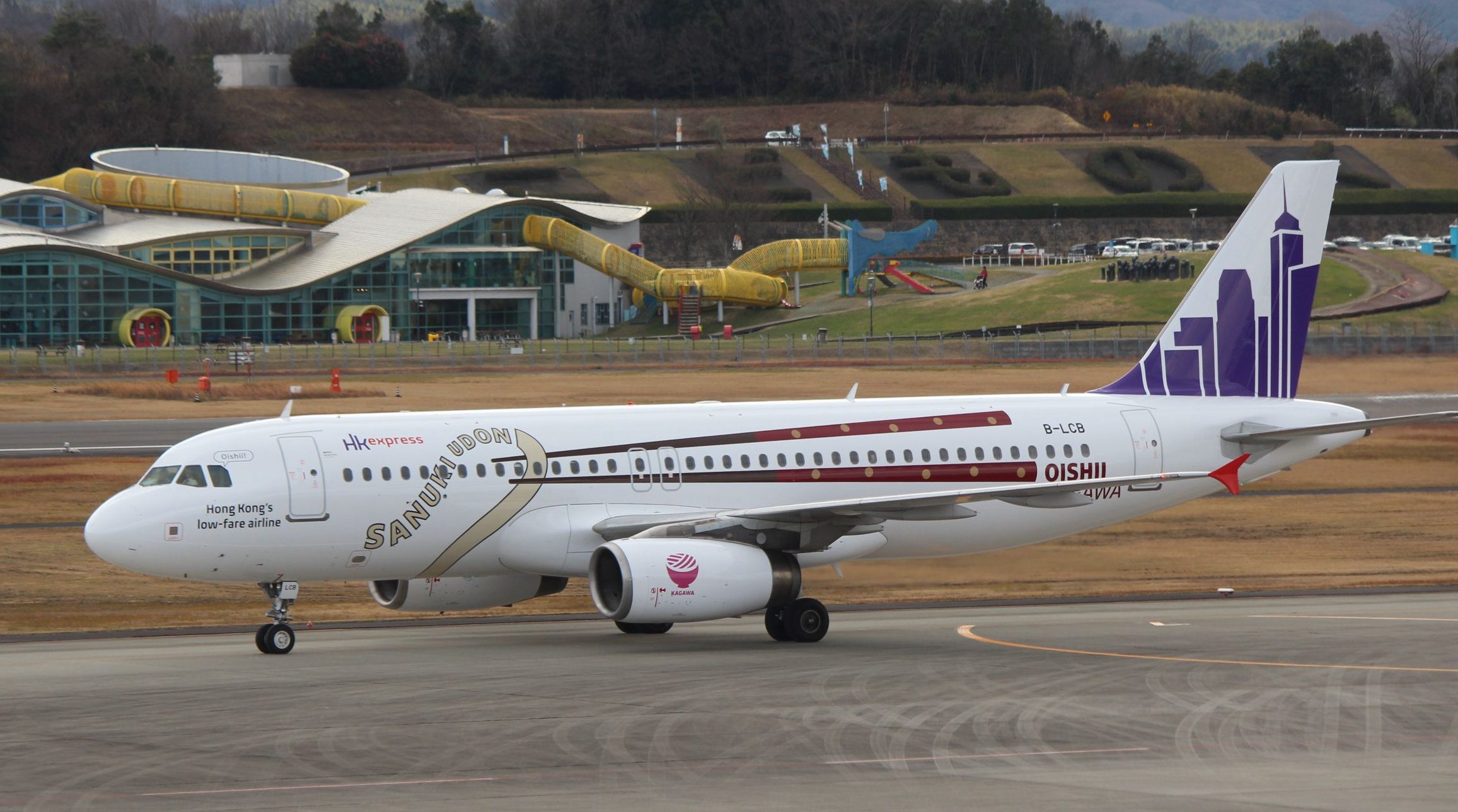
Shikoku is the smallest and least populous of the four main islands of Japan, located to the south of the main island Honshu, and east of Kyushu. It is home to the Kagawa Prefecture whose capital city is Takamatsu, famous for its Ritsurin Gardens, which date back to the early 17th century. HK Express has been expanding its reach as a low cost carrier from its Chep Lap Kok base and on July 6, 2016 it opened a new route connecting it with Takamatsu. At the same time the airline named one of its A320s, B-LCB, ‘Sanuki Udon’ after the popular type of udon noodle that originates from Sanuki in the Kagawa Prefecture.
Whilst it might seem odd to name an aircraft after a food this was actually the 7th member of the fleet to gain the name of a food item – other examples being Tebasaki and Siu Maai. Apparently this has become something of a tradition for the airline following a 2013 ‘Name the Plane’ competition on Facebook. Originally planned as a thrice weekly service the schedule was increased to four times a week in September and is the only direct link between the two cities. By December 2016 the load factor on the route was up to 85%.
HK Express has obviously been happy with the service as in January 2017 it went one further and rolled out a special livery for ‘Sanuki Udon’ to celebrate Takamatsu and Kagawa. The first flight with LCB sporting the new design (from LIFT Strategic Design) was flown on January 13 as UO1522. Unusually the livery is asymmetric with completely different designs on each side of the aircraft.

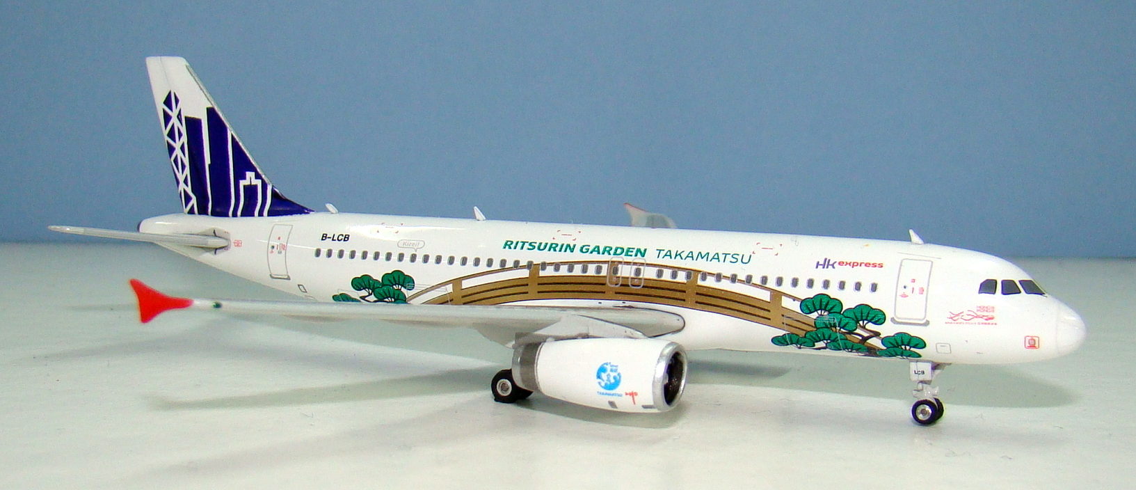
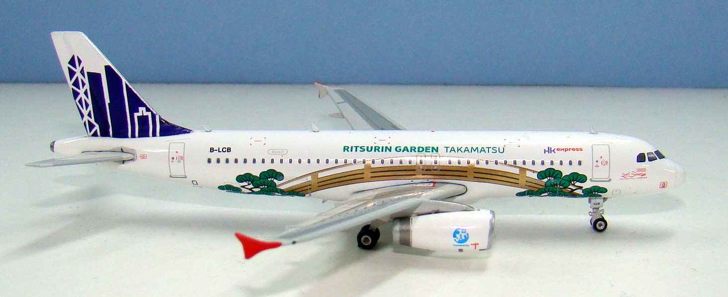
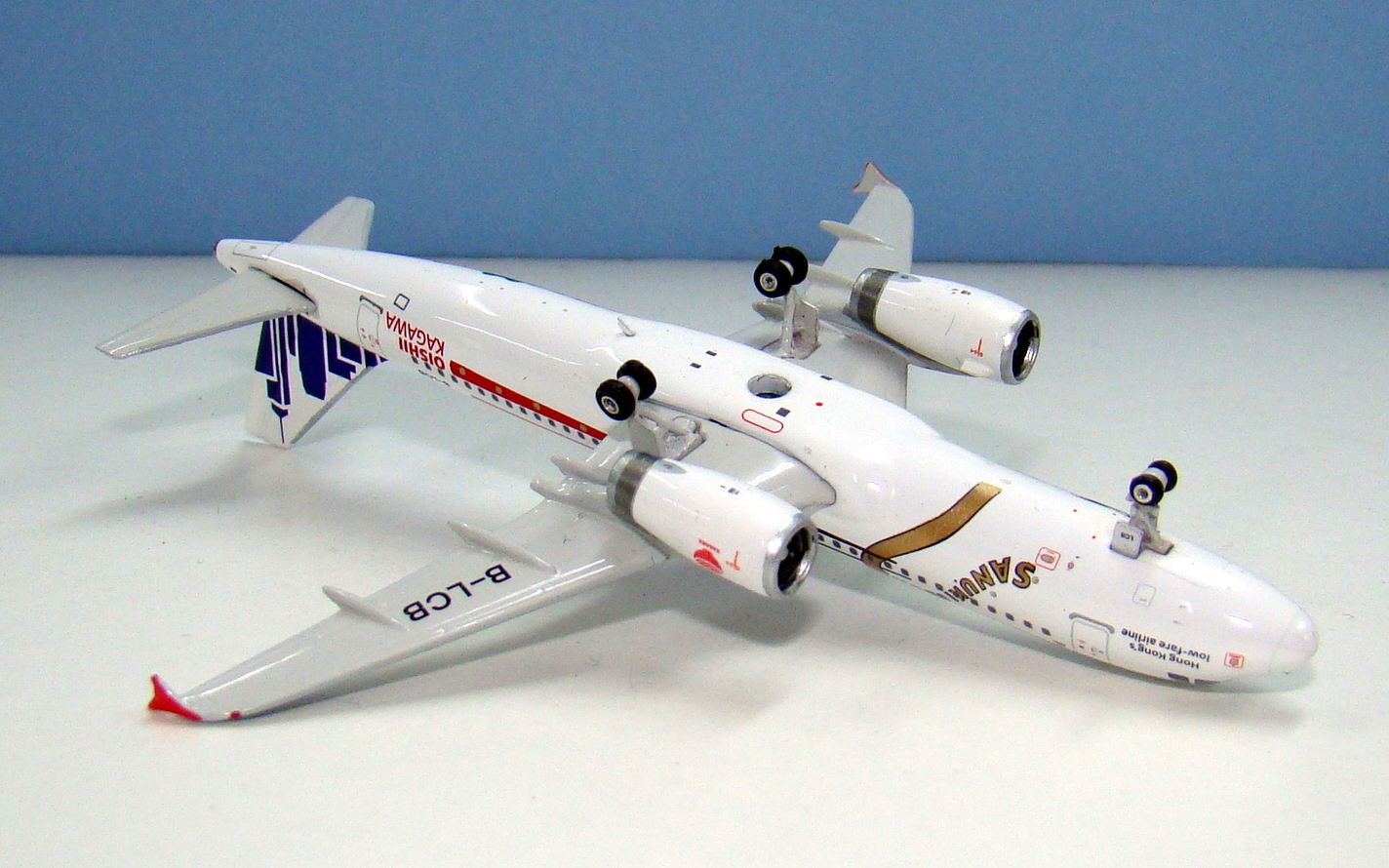
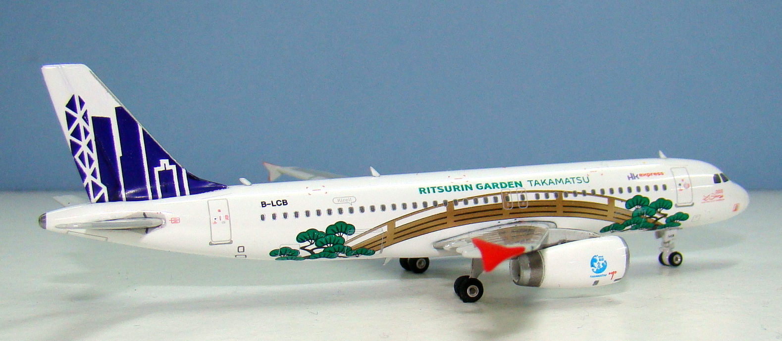
On the port side the livery features a pair of giant chopsticks holding the Sanuki Udon noodles with the Japanese word ‘Oishii’, which means delicious. On the starboard side the livery celebrates the Ritsurin Gardens with a Japanese style bridge and trees and the phrase ‘Kirei’ meaning beautiful.
B-LCB itself is a 2004 build A320 that was originally delivered to Jetstar Australia as VH-VQX, but almost immediately was transferred to Jetstar Asia as 9V-VQX. She was returned to her lessor HKAC in June 2014 and joined HK Express in late July 2014.
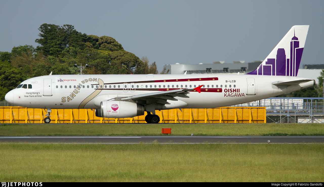
HK Express has certainly built a strong relationship with the local government of Kagawa Prefecture and their partnership has seen nearly 60,000 passengers travel to Takamatsu within the route’s first year. The airline runs regular promotions to entice travellers with special fares while B-LCB continues to advertise the destination across the HK Express network. It appears a textbook example of an airline working with the local community for the benefit of both.
For more about HK Express see my blogpost: Cramming Them In: HK Express’ New Airbuses
THE MODEL
The format for my reviews is to split them into three key areas:
- The mould of the aircraft
- The paint and livery
- Printing and quality control
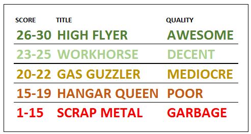
Each can get a maximum score of 10 for a section giving a maximum combined total score of 30.
THE MOULD
The Phoenix Airbus A320 is a solid mould and shares the majority of its characters with their A321, however fortunately it doesn’t share some of that mould’s failings. Somehow the shorter length of the A320 works in the moulds favour and it looks more like an A320 than the slightly TU-204-esque A321 mould. It also has correct wings, unlike the A321.
The nose of the mould is good but a little too heavily rounded. From distance the nosegear looks good too but up close the gearleg is a bit chunky and undefined whilst the gear door is a little too large. The IAE engines on both Phoenix and Aeroclassics A320 family aircraft are slightly too large also.
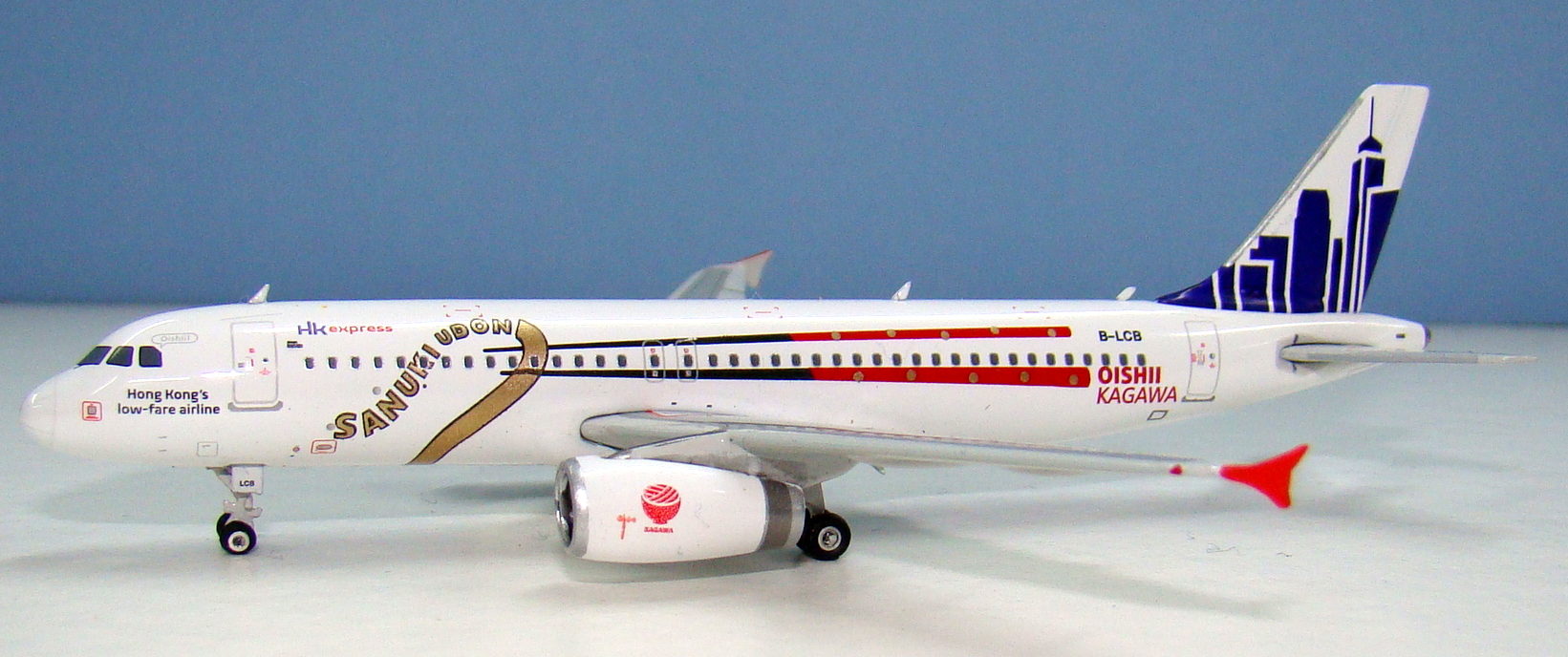
Being a modern mould this is a slot in wings model, which means no ugly seam line, however in my opinion Phoenix don’t do enough to accentuate the wing/body fairing and the mould is a little slab sided, especially just above the wing.
Moving towards the rear of the fuselage and the Phoenix A321 scores highly; the maingear, tailcone and vertical stabiliser are excellent whilst the aerials are present and well sized. At least four of them are anyway – the smallest aerial on the forward belly is absent.
I have absolutely no problem with buying the Phoenix A320 (in fact it is the only narrowbody Phoenix mould I can say that about). It is inferior to the Aeroclassics and Panda offerings but not to the extent that the JC Wings/Gemini mould is. For a detailed comparison of the A320 moulds available in 1/400 scale see:
Comparing A320s – 1/400 Scale Detailed Mould Review
SCORE – 8
PAINT & LIVERY

As I’ve stated this livery is in fact really two separate liveries, which’ll make it doubly hard for Phoenix to score highly on this review as it gives them two chances to make mistakes. Both of the schemes are inventive and attractive. It seems almost a shame not to have separate aircraft wearing each scheme, especially as I display my models facing right to left, which means one side of the scheme is obscured.

Starting with the Sanuki Udon scheme on the port side and the livery is close to spot on. Placement of the livery elements is good, with only the OISHII KAGAWA titles being slightly too high. The colours of the chopsticks are accurate but the gold of the titles and noodle is a little too strong.
On the starboard side the ‘Ritsurin Gardens’ livery is a little more complex but equally well reproduced. The green of the trees is strong but again the golden elements (in this case the bridge) are a little too golden. Placement of the livery, and the small ‘Kirei!’ speech bubble emanating from one of the rear windows is great.
The common livery elements, consisting of the standard HK Express tail, red winglets, HKexpress titles and Hong Kong logo are all fine aside from the colour of the main tail. Phoenix appear to be using a dark blue rather than the purple of the real thing.
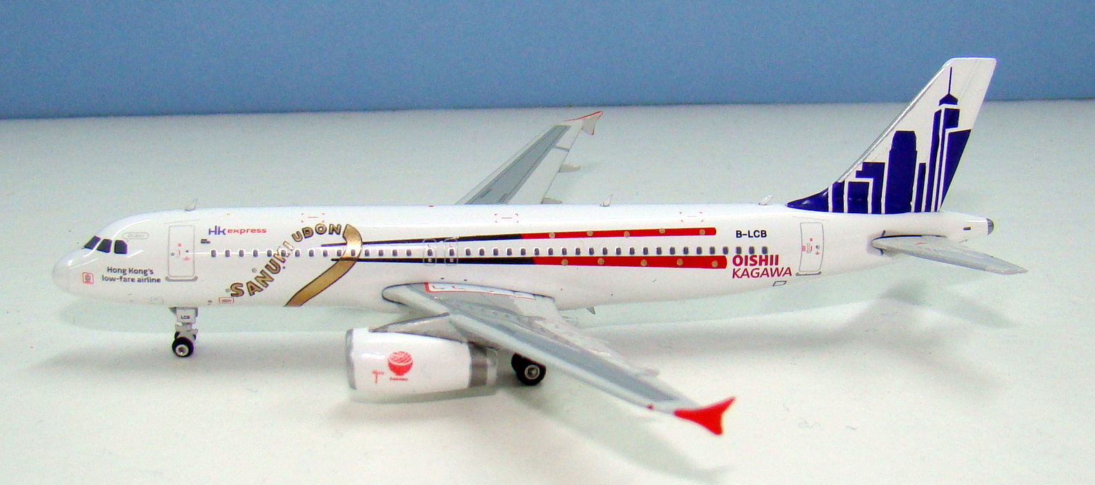
Considering the opportunity for disaster with this livery I am more than happy with what Phoenix have done here. I’ll knock a point off for the colours, but it doesn’t in any real way impact my enjoyment of the livery’s reproduction.
SCORE – 9
PRINTING & QUALITY CONTROL
So it is now we look at Phoenix’ Achilles heel – quality. They seem able to reproduce their A320s with less issue than their 737s – at least the cockpit windows are printed in the right location, although I admit they aren’t perfectly shaped. I don’t think Phoenix’ printing is up to the standards of JC Wings/Gemini Jets but what is here is well done with very fine lines. Even better there are no unwanted imperfections creeping in to the finished product.
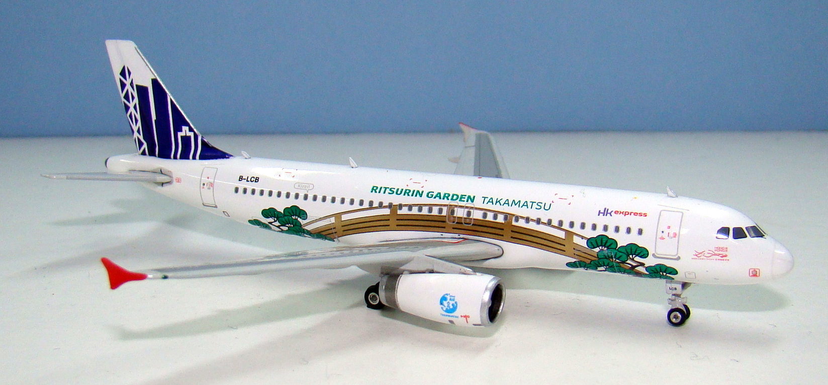
Phoenix also seem to have banished ugly silver fanblades with the IAE engines having nice dark rims and well defined dark fanblades. The quality of the construction is good. It is only the undercarriage that lets the model down here (once again). There is a small tyre tab on the maingear but the issue that I notice the most is that the nose gear is bent to the starboard slightly. It’s not dreadful but it is there.
SCORE – 9
CONCLUSION
Phoenix has had some pretty ordinary scores for narrowbodies in my reviews so it is nice to see they can perform. This is a fine model and one that I am happy to add to my fleet. JC Wings have announced this livery also but given the finish here there is little reason to wait for the JC release, which will be on the inferior A320 mould they are using.
FINAL SCORE – 26

