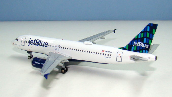
JC Wings new A320 mould has been out in the market since the end of 2016 but aside from an A320neo I have not had the opportunity to hold it in my hand until now. JetBlue meanwhile falls well outside of my collection criteria but is an airline that is easy to like (aside from all the blue name airline copycats it has spawned).
THE REAL THING
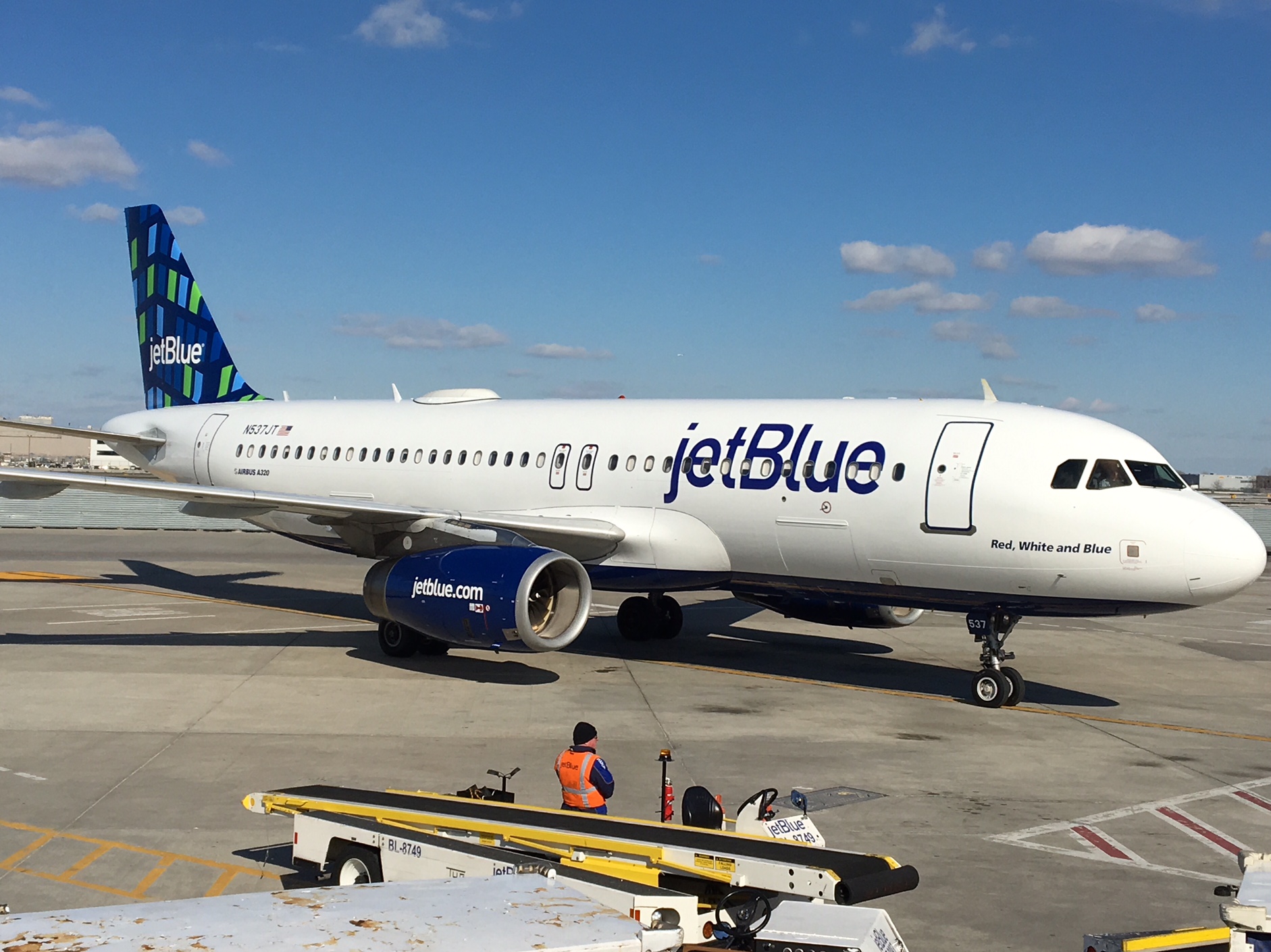
JetBlue has successfully grown from niche startup carrier to the 6th largest air carrier in the United States (admittedly that title is easier to get with all the mega-mergers) and carved out a strong position especially on transcontinental routes and services to the Caribbean from New York and Boston. Destinations served have grown to 100 and the fleet has grown accordingly from a handful of A320s to 233 aircraft, of which only 60 Embraer 190s are not A320 family members.
The airline has always had a playful streak naming its fleet and painting a range of designs on the tails. To mark its seventeenth anniversary it has created a special scheme called “Blueprint” to be worn on an Embraer and also introduced a new tailfin livery to celebrate its hometown of New York.
The tailfin design is called “Highrise” and represents the tall buildings of the New York skyline using the effect of bright lights through the windows of the city’s high rise buildings. In marketing speak it reflects: “JetBlue’s growth and New York’s perpetual desire to reach for the sky”. The “Highrise” livery uses four of JetBlue’s signature colours and apparently the windows can be “turned off” to create a new arrangement of patterns for use on different fleet members.
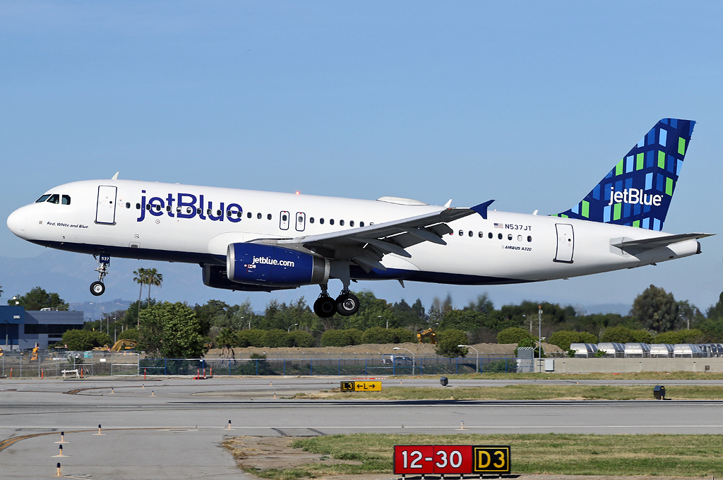
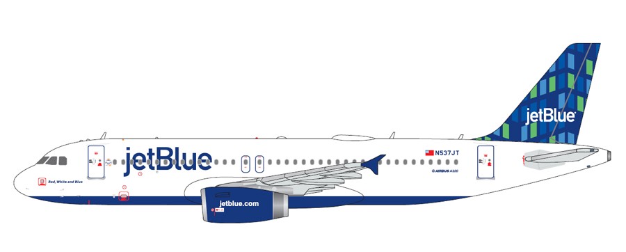
The first aircraft to wear the new colour scheme was a veteran 2002 build Airbus A320-232 registered N537JT and named “Red, White and Blue”. She was rolled out of Airbus’ US Manufacturing Facility in Mobile, Alabama after spending 9 days being repainted. This particular aircraft was delivered new to JetBlue in June 2002 wearing the “Squares” tail colours but was one of 9 A320s that were sold to German charter airline Blue Wings in 2006-2008. This was off the back of a downturn in JetBlue’s profitability, which led to cost cutting measures including the sale of some aircraft.
Blue Wings itself ceased operations in January 2010 and D-ANNI resumed service with her original operator in September wearing her former registration and name. She is now one of 130 A320s operating across the JetBlue network.
THE MODEL
The format for my reviews is to split them into three key areas:
- The mould of the aircraft
- The paint and livery
- Printing and quality control
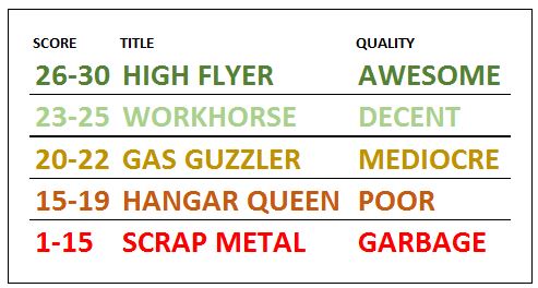
Each can get a maximum score of 10 for a section giving a maximum combined total score of 30.
THE MOULD
I reviewed Gemini’s recently released LATAM A320neo in May and I can confirm that the new mould A320ceo does share the same fuselage as the A320neo, and that sadly this is the root of its troubles. Due to this it, of course, has all the same problems in the fuselage as the neo. To summarise these issues are in order of importance – most annoying to lease:
- The nosegear is in the wrong position. It is too far back really rather noticeably so.
- The nosegear leg itself is chunky and rather ugly.
- The tailcone after the vertical stabilizer is not long enough and the end point is too stubby.
- The nose shape is inferior to the earlier JC Wings mould and not a patch on the Aeroclassics
- The underside rear aerial is missing (in keeping with most JC Wings moulds)
- The aerials are a bit too large (again common on JC Wings moulds)
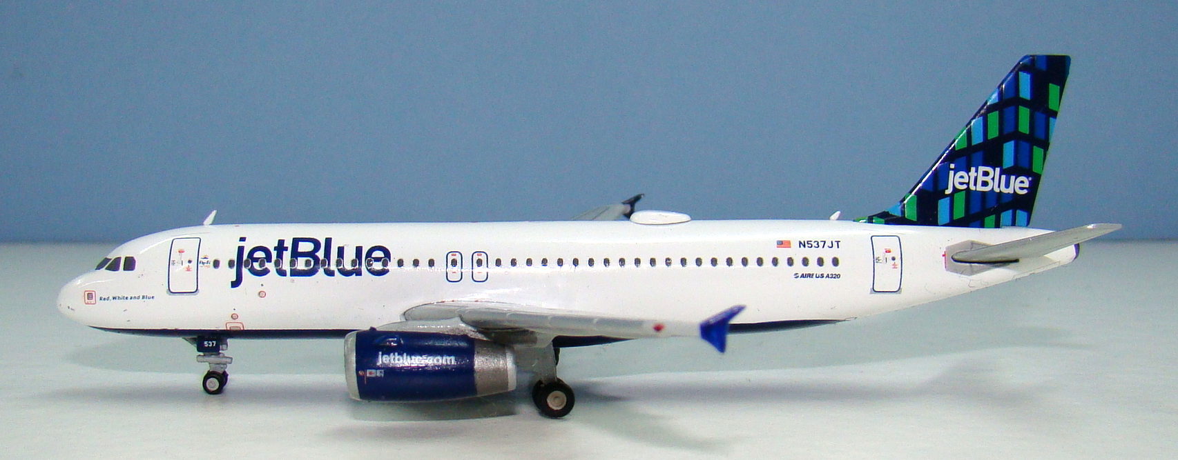
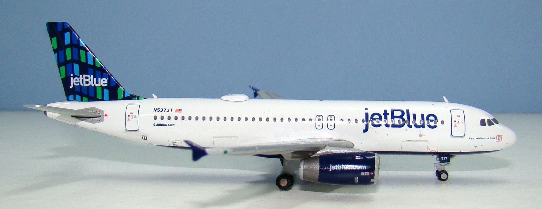
There is clearly some variation in the moulding of these new A320s too as the nose on this one is different to that on the LATAM. This nose seems pointier both from the curve upward underneath and that coming down from the cockpit windows. It is not an improvement really. On this particular model another aerial is also missing, a rather large one behind the satnav dome.
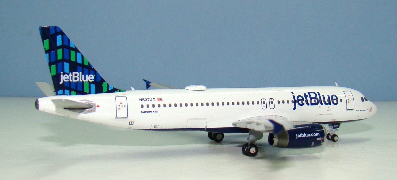
Despite all these complaints the mould isn’t a complete junker. It is the nosegear issues that really grate with me. Otherwise I can forgive most of the problems as the aircraft is still recognisably an A320. At least on the A320ceo the engines and wings present no issues.
SCORE – 6
PAINT & LIVERY
JetBlue maybe a low cost airline but it is one that understands it needs to appeal to business travelers too so its livery is understated, businesslike and attractive. As with Norwegian the multiple tail schemes adds to both the culture of the airline and also to the attractiveness of the aircraft. I am impressed by the many ways jetBlue has used patterns on their tails. This scheme is perhaps not as exciting as some of the others but it does the job.
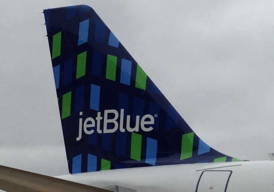
As I said above this “Highrise” scheme uses four of jetBlue’s base colours but three of them are in the tail alone. The deep blue of the belly, titles and tail base is well realized by Gemini here. The colours on the fin are not so good. They all seem a bit washed out but the green is by far the worst. It is supposed to represent windows with lights on but is not as bright as on the real thing.

Placement of the main titles on the fuselage is fine as is the blue belly and engines. The aircraft name “Red, White and Blue” is too fine on the model compared to the thick text on the aircraft. Placement of the windows on the tail is good but not perfect either. It perhaps shows imperfections in the shape of the mould’s tailfin that the lower rear skyscraper windows and those along the rear rudder edge do not quite fit on the tail enough. Lastly there ought to be a blue outline around the large satnav dome on the roof, which is missing here.
Overall this is a ‘just ok’ effort on the livery. Nothing drastically wrong but not perfect either and a bit lazy.
SCORE – 8
PRINTING & QUALITY CONTROL
There is some really detailed printing on this model, especially on the passenger and cargo bay doors. The underside of the fuselage is also really well printed, so it’s a shame that the rather obvious lines around the wing join are missing. I can understand that the manufacturers want to make it obvious this is a slot in rather than cradle mould and the lines make it look like there is a seam, but on the real thing the lines are obvious and without them the aircraft looks a little slab-sided.
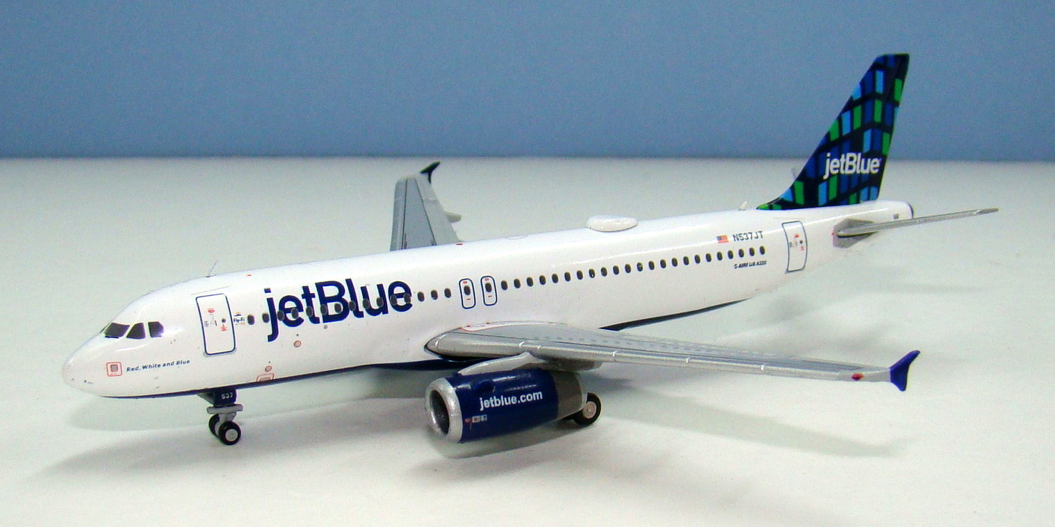
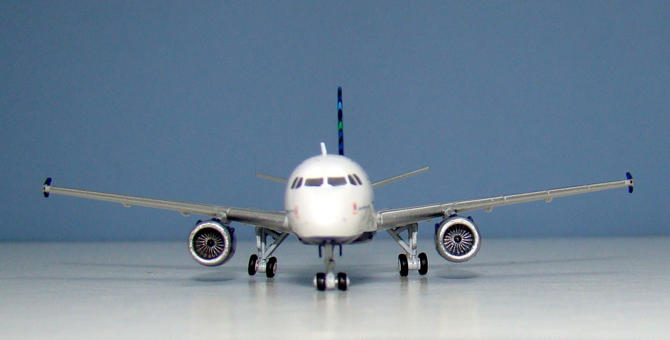
I’m also not completely sold on the definition of the engine titles and of course the blue line around the satnav dome is missing. At least the satnav is beautifully fitted as is the rest of the model aside from one area. This is the maingear. Neither of the maingear wheel trucks sits level on the ground, although the starboard side is worst. The finishing on the gear legs themselves is also rough, marked and uneven. From the side the model maingear looks rather splayed. That’s a shame and does detract from the models appeal.
SCORE – 7
CONCLUSION
This model would be much better with the undercarriage just missing outright. The nosegear is chunky and in the wrong place, whilst the maingear is poorly detailed and fitted. The missing aerials and some missing printing aren’t great either – then again if this were an Aeroclassics A320 there wouldn’t be any aerials or satnav dome. My other criticisms are relatively minor but altogether it adds up to a distinctly middling effort.
FINAL SCORE – 21/30


No chance of you doing a comparison review with the AC version is there? As always thank you for your thoroughness!
You read my mind. I just finished doing a complete side by side review of the Aeroclassics, Panda, Old JC Wings, New JC Wings and Phoenix A320s. Similar format to the A330 one I did in March. It should be published at Yesterday’s Airlines next week.