

I have been tempted by several of the recent British Airways heritage livery models, but post-2000 non-Chinese airlines are well outside my collection criteria so I have avoided them all until now. That isn’t a reflection on the models and several of the Gemini 747s and the Aeroclassics A319 looked good (the less said about the Phoenix attempts the better). The chink in my collecting armour came with this model as it represents a current aircraft wearing a retro-scheme that it, largely, wore earlier in its career. In effect it is a retro-jet that isn’t a retrojet. As such, and due to the paucity of Landor 747s floating around, I’m more than happy to add it to my collection.
THE REAL THING
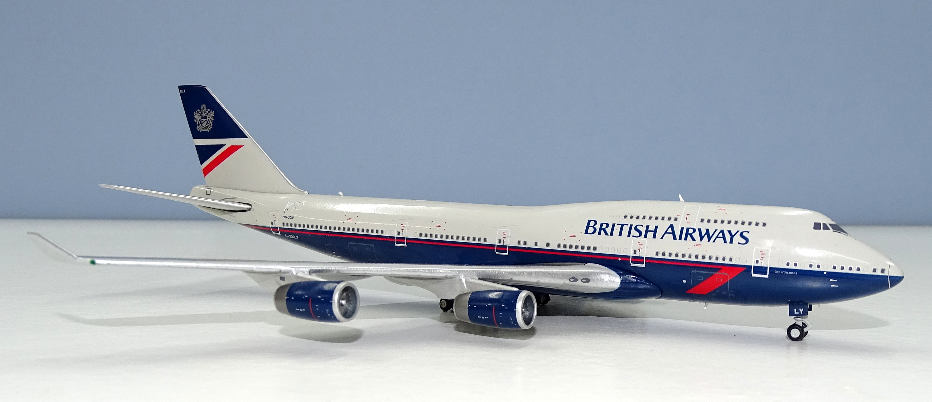
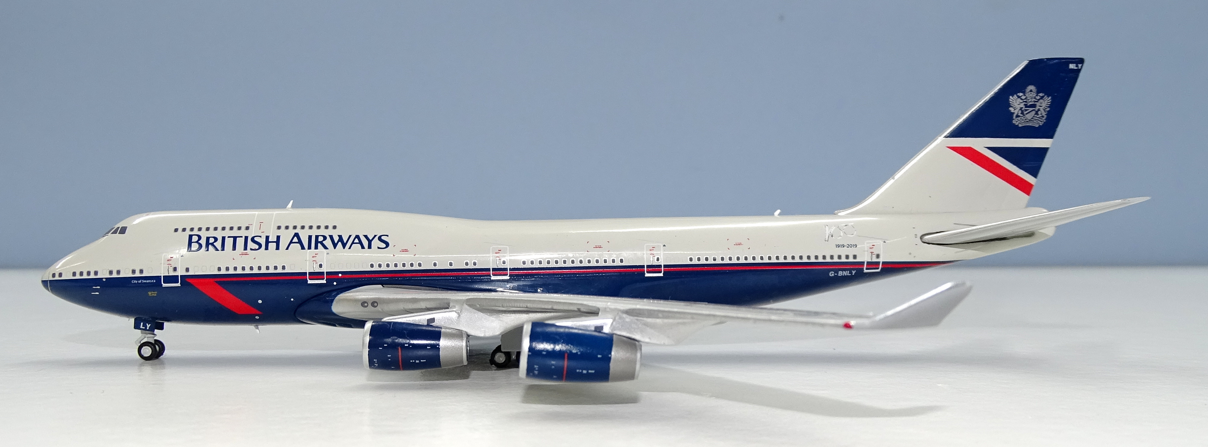
The 100th anniversary of British Airways (or at least the airlines that went on to form BA anyway) has been a boon to model makers since not only does BA have some of the most popular liveries of all time in its back catalogue but the enthusiast has now got to see them on some more modern aircraft types. Retrojets have become increasingly common and an excellent way for an airline to get some positive publicity while also shouting out their heritage. British Airways has certainly made ‘hay while the sun shines’ and the BA Landor scheme 747-436 was the third of the four retro-jets produced, three of which have been 747-400s.
The Landor scheme is perhaps BA’s most popular livery and was unveiled in December 1984 to replace the Negus & Negus livery, which BA had worn since its formation in 1974. It has become famous as the Landor livery despite Landor Associates being responsible for more than thirty of the world’s most famous liveries since the late 60s. The scheme clearly riffed on the previous BA livery but updated it to make a more business-like scheme suitable for Thatcher’s Britain. It’s replacement in 1997 by the Utopia scheme was not welcomed by many, including famously Margaret Thatcher herself.
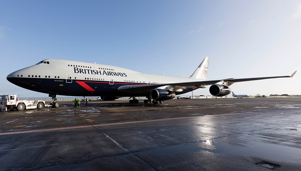
British Airways was an early customer for the Boeing 747-400, having long ago forgotten the service entry issues it had with the original 747s, not due to the aircraft, that saw them languish on the ground at Heathrow for nearly a year. In fact, it ordered its first 16 of the series 400 as early as August 15, 1986 well before it flew for the first time. Incremental follow on orders topped up the backlog and by November 1998 it was celebrating taking delivery of its 50th 747-436. Eventually it acquired 57 of the type with the last arriving on April 29, 1999.
BA became the largest operator of the 747-400, easily eclipsing rivals like Japan Air Lines (30) and Singapore Airlines (32) and certainly in 2019 is easily still the largest operator. The ‘Queen of the Skies’ has been rapidly disappearing from the world’s airline fleets and, aside from BA, only KLM and Lufthansa still operate more than ten of the type. Even though other airlines have been finding the series 400 noncompetitive, in today’s age of super-twins, BA doesn’t seem to have any issues operating the venerable, and paid for, fleet across the Atlantic.
.jpg)
Even at British Airways though the service history of the 747 is drawing to a close. The airline has announced that its last 747s will be retired in 2023/24 although the carrier’s order backlog for Airbus A350s, Boeing 787s and 777-9s gives it some flexibility as to the actual date. Certainly, it is expected that the three centenary retro-jet 747s will remain in their ‘new’ colours up until retirement date. The first Speedbird 747-436 was delivered on June 30, 1989 and G-BNLY was delivered on February 10, 1993.
THE MODEL
The format for my reviews is to split them into three key areas:
- The mould of the aircraft
- The paint and livery
- Printing and quality control
Each can get a maximum score of 10 for a section giving a maximum score of 30.
THE MOULD
For me, as I suspect it isn’t for most people, the Gemini Jets / JC Wings 747-400 mould isn’t the first choice when it comes to a 747; but since BigBird Mk 3 are unwilling, or unable, to use their casting at all regularly, and JC Wings new mould is still under development, the Gemini mould is the next best available option. It is certainly a million miles ahead of the Phoenix 747, which easily equates as one of the worst castings ever made in this scale. Certainly, the Phoenix BA centenary 747s have looked really very poor.
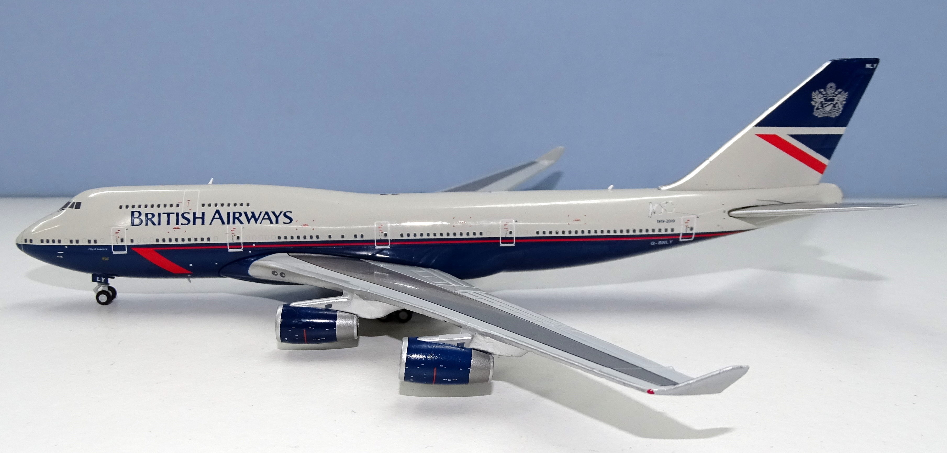
Gemini’s old 747 moulds have been around since nearly the start of 1/400 production, but they are solid and reliable. In recent years they have been upgraded with new undercarriage and now antenna too, both of which are marked improvements for the original casting. The aerials (two above and one below) are all excellent, however the model lacks the three aerials on the underside of the rear fuselage. It also lacks the small dome on the roofline but I’ll discuss that more in the quality section.
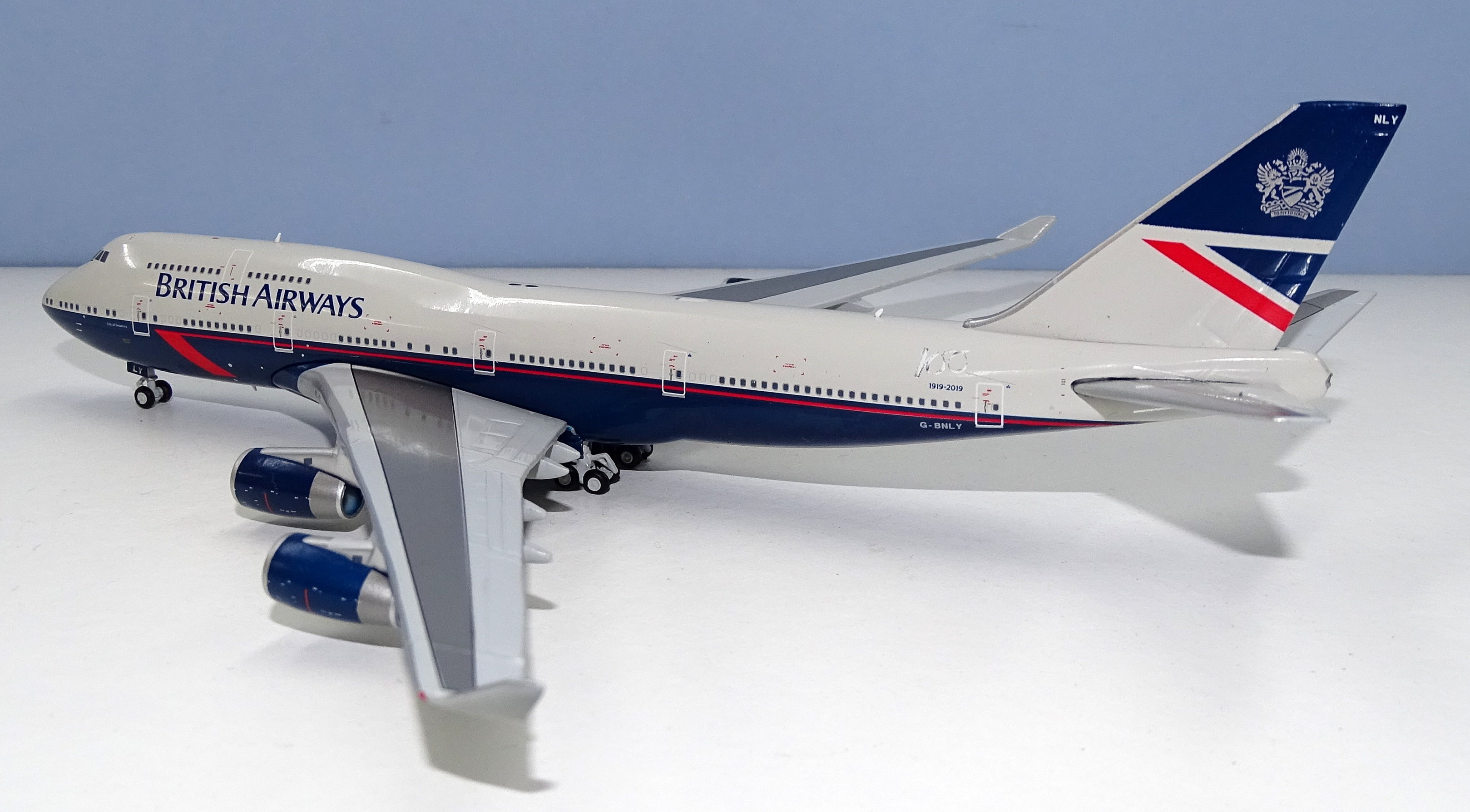
The tail, rear fuselage and wings are very nice, however the age of the mould shows in a couple of places. The rather cumbersome wing pylon/wing join isn’t great and this is a well known ‘feature’ of these Gemini 747s. I can live with it, whilst the cradle wing/fuselage join is tastefully done. The mould would be improved if it were seamless and had better pylons, but given its age it seems silly to have these expectations.
The nose of the mould is a bit too pointy but it still looks like a 747. Ignoring the pylons this really is a very nice mould. It’s not as good as the BigBird and Witty 747s, but little is. Presumably the future of this mould is shorter than the future of the actual BA 747s but if Gemini released more ‘classic’ 747-400s on this mould, with modern printing, I’d still be a happy lad.
SCORE – 7
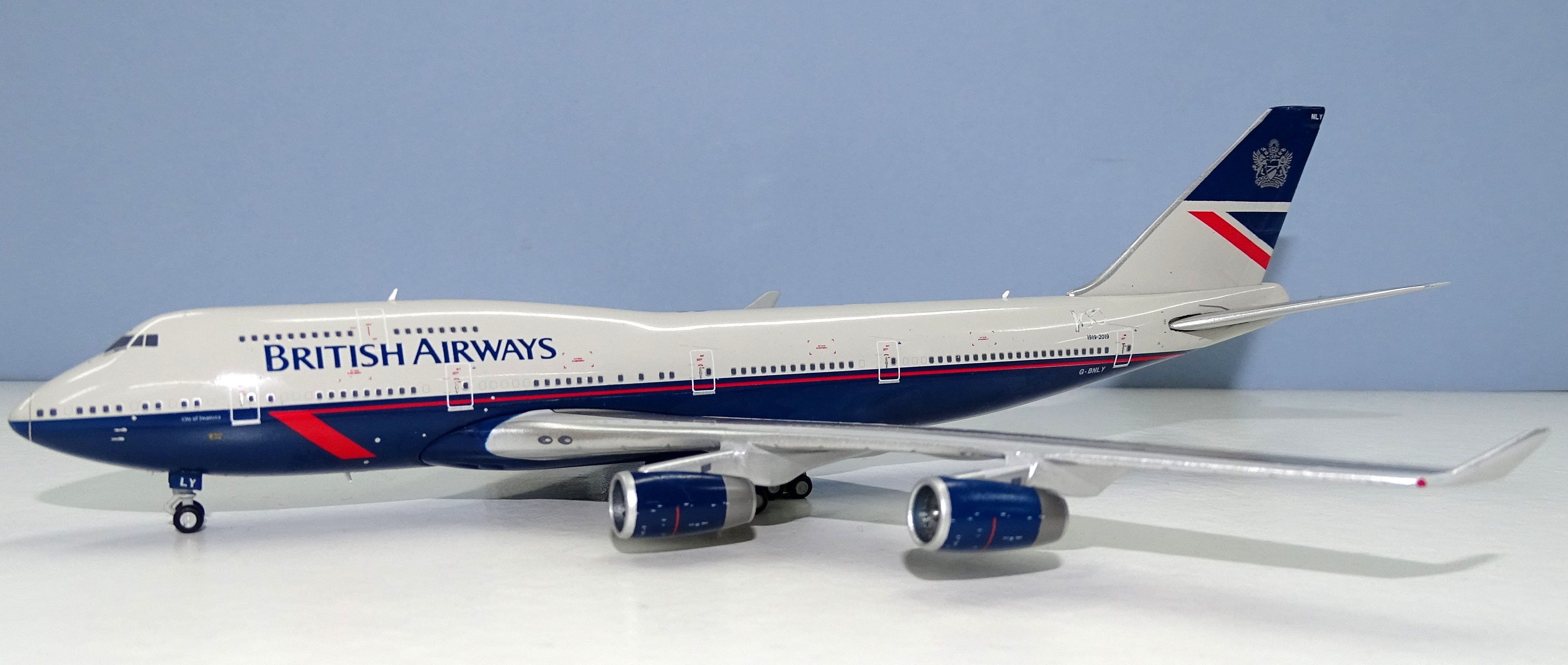
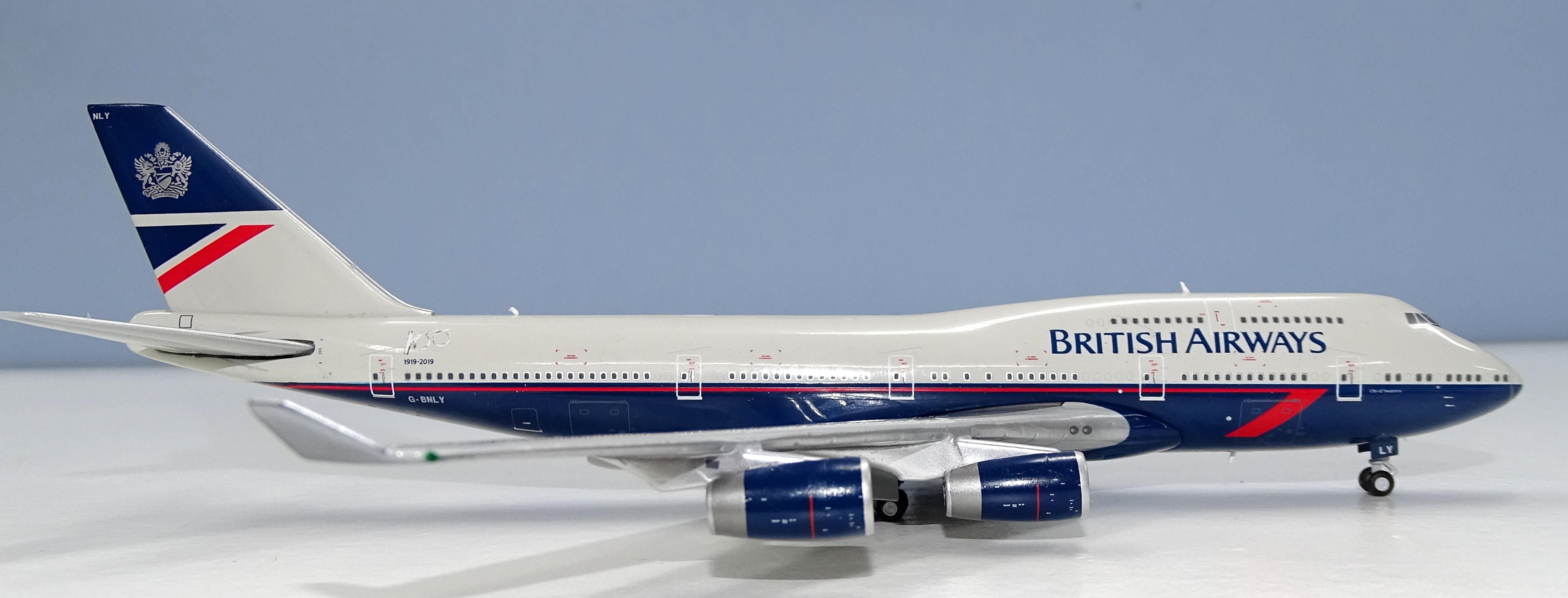
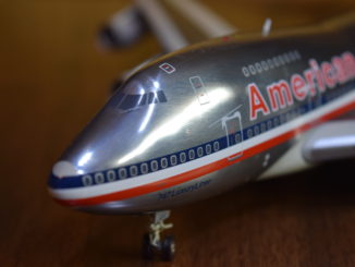
PAINT & LIVERY
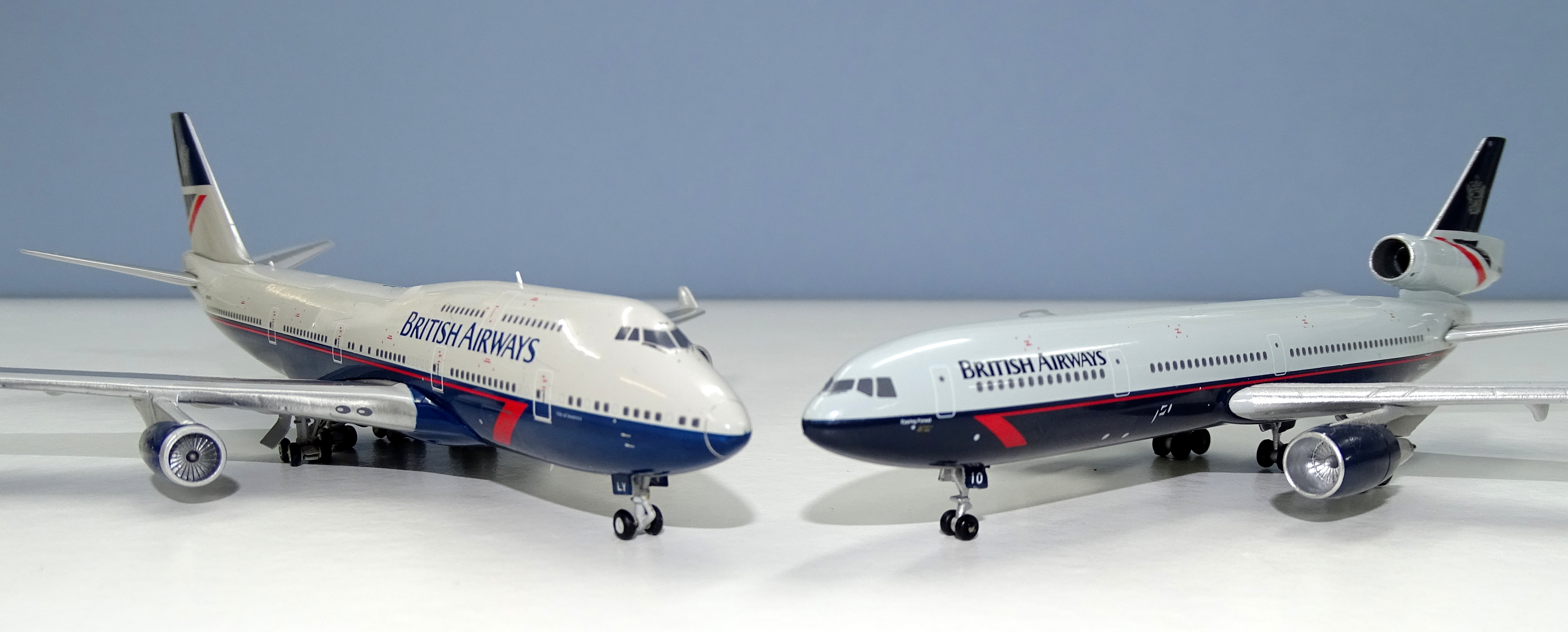
The essential elements of the Landor scheme are well known. The roof is ‘Pearl Grey’ and the belly is ‘Midnight Blue’. The speedwing meanwhile is ‘Brilliant Red’. Even so, despite its familiarity 1:400 manufacturers really struggle with greys and, just like with the United Battleship scheme, everyone seems to do the grey colour slightly differently. I was under the impression that Gemini have access to the actual pantone colours for these sorts of liveries, as part of the fact they are licensed to make them, but in this case I’m not convinced they have got the shades correct.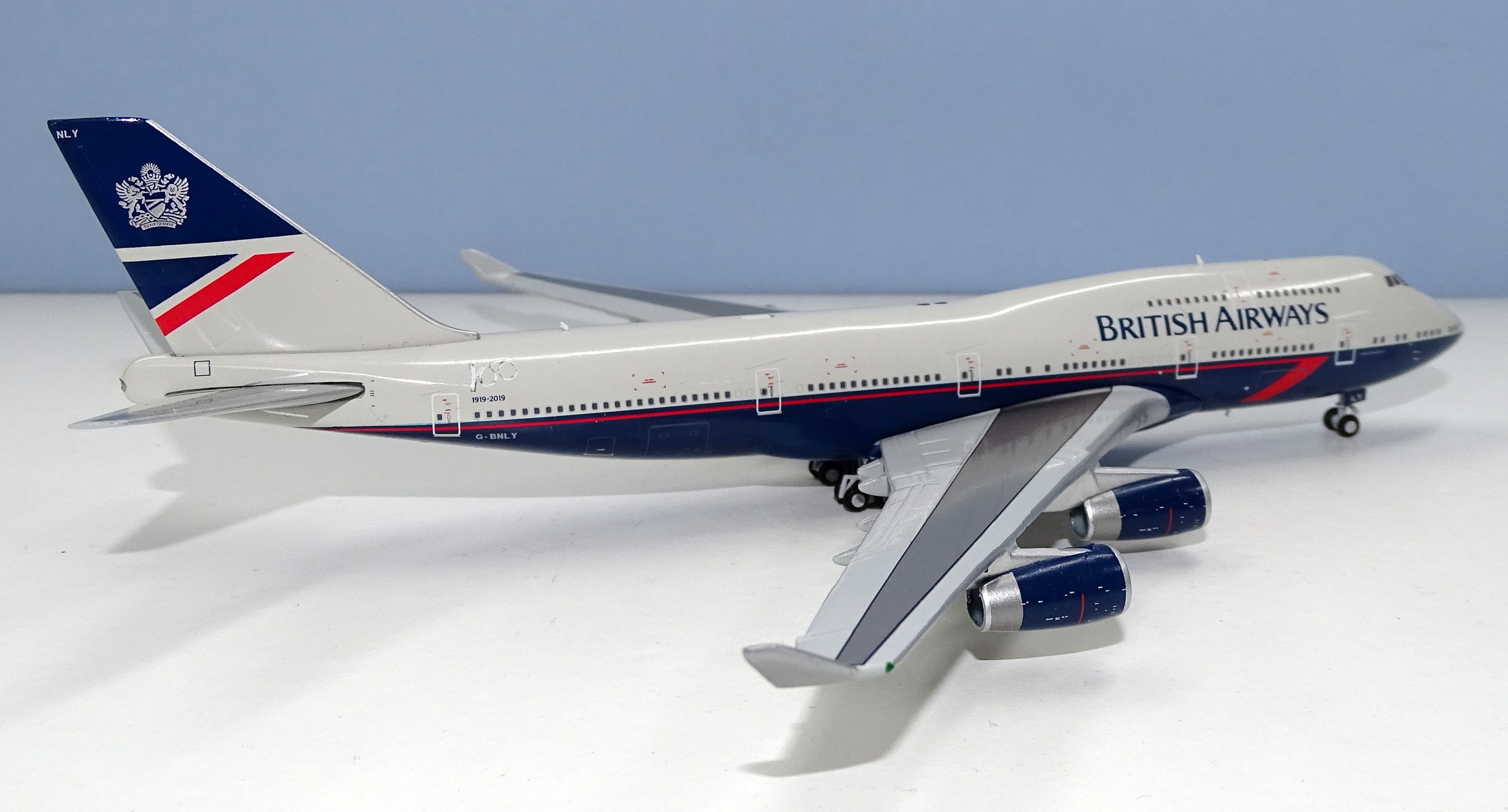
I freely admit to not owning a lot of BA Landor schemed aircraft, but I do have several of the recent NG 757s and a Witty DC-10. This 747 doesn’t match those, and also doesn’t look to my eye like it matches images of the real thing. The grey looks too brownish, the blue not dark or rich enough, and the red too dark. The model still displays ok next to other Landors I own but it seems off. I could be wrong here and I will defer to others with larger Landor fleets but for me this model’s colours aren’t accurate.

The rest of the aircraft livery is excellent. The major elements are all placed well and small details such as the aircraft name, ‘City of Swansea’, and Royal Mail logo look good. The 100-year logo rather blends in to the Pearl grey but it does so also on the real aircraft. Since I want to treat this like a real 90s 747 that’s fine by me anyway. A particular highlight is the ‘Fly to Serve’ crest on the tail. It is beautifully printed and a lovely silver.
SCORE – 8
PRINTING & QUALITY CONTROL

Printing on the model is very good with some strong detailing, in particular on the engine nacelles. There are no print errors I can see except for the nosecone. Although it is good that they have printed it (it is quite obvious on the real thing) it isn’t as fine as it could be and the lower portion for some reason looks like it is forward of the upper. This could be a reflection of the mould’s nosecone itself and not the printing.

My only other criticism of the paint is that the engine pylons are way to silvery as are the engine fanblades themselves. The pylons should be a matt light grey and the fans darker. I’m not sure why manufacturers sometimes get fanblade colour correct and other times seem to forget about them altogether.
I have seen other collectors complain about the build quality of their 747s from Gemini but this model isn’t too bad. Then again it isn’t perfect either. The outermost engine on the port wing sticks upwards ever so gently and is out of alignment with the other three.
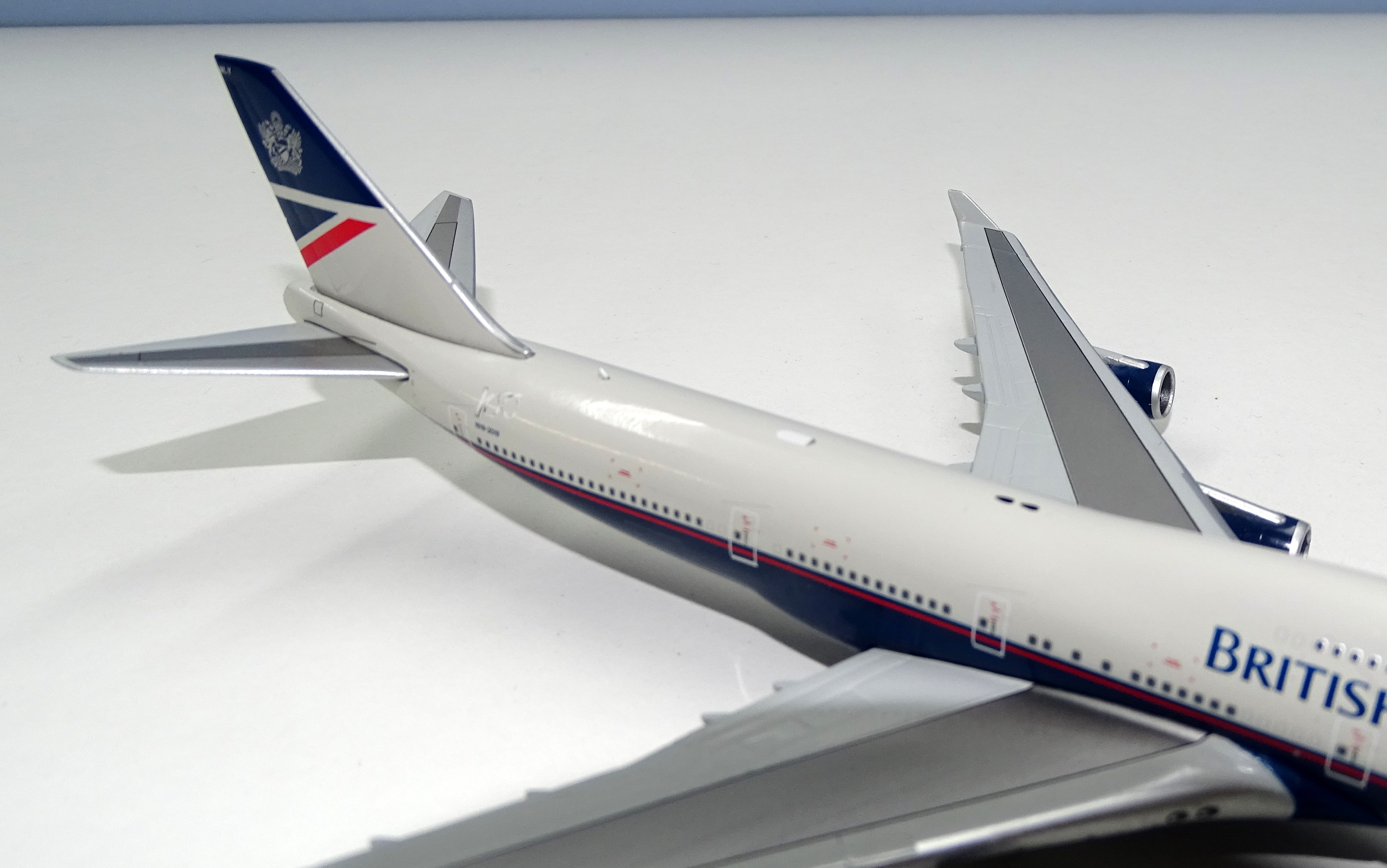
The model is also lacking the Wi-Fi dome atop the fuselage and I’m not sure why. The other retro 747 model had it, but this is an area where there have been some issues. Perhaps Gemini decided to remove it from this model on purpose. Certainly, it looks like there is a space for it, but the outline is merely printed rather than in relief. I’m going to assume this is an on-purpose feature and it actually makes the aircraft look more like it did in the 1990s before things like Wi-Fi had been invented.
SCORE – 8
CONCLUSION
I like this model quite a lot but it does illustrate that there is only so far you can go to spruce up an older mould, and that having licensed models isn’t a panacea either. Nonetheless, Gemini have produced a much better model than the competition and if you are in the market for a Landor 747 this is the model you should be looking to get in 2019.
FINAL SCORE – 23/30
Purchase GeminiJets 1:400 scale British Airways 747-400 “Landor Livery”
Thanks for another great review Rich. As a collector of all BA models, I actually don’t haved an issue with the ‘Pearl Grey’ roof on this model. Maybe others are too ‘bluish’? I think it’s acceptable unlike another manufactuer’s BA B767 that was definately ‘too brownish’. The only issue I have with this model, that you never mention in your reviews, is the price! For an old mould such as this, Gemini’s price hike is killing any interest in purchasing further models from them.
As a collector of all BA liveries and possessing a large Landor section too, I can honestly say that none of the manufacturers have a consistent pearl grey. Often there are mis-matches within a single manufacturer’s Landor output too. And of course the real life pearl grey was another of those paint tones that looked different in various lighting conditions, often looking it’s best in strong sunshine, perhaps coincidence given Landor’s California origins, but here in the UK I’d often refer to the tone as ‘that dirgey grey’ and one that reminded me of a white t-shirt accidentally laundered with a pair of black socks !