

New liveries must be a boon to the model manufacturers especially when they are for globally recognised brands like Air Canada. Even Phoenix has been interested in the Air Canada rebrand and they almost never make airlines from North America. AC is directly in Gemini’s sphere of interest so it is no surprise to see them produce multiple Air Canada models recently. April’s release of an A321 gives me the opportunity not only to checkout the new scheme but also the new JC Wings A321 mould too.
THE REAL THING
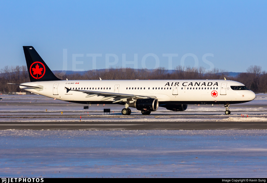
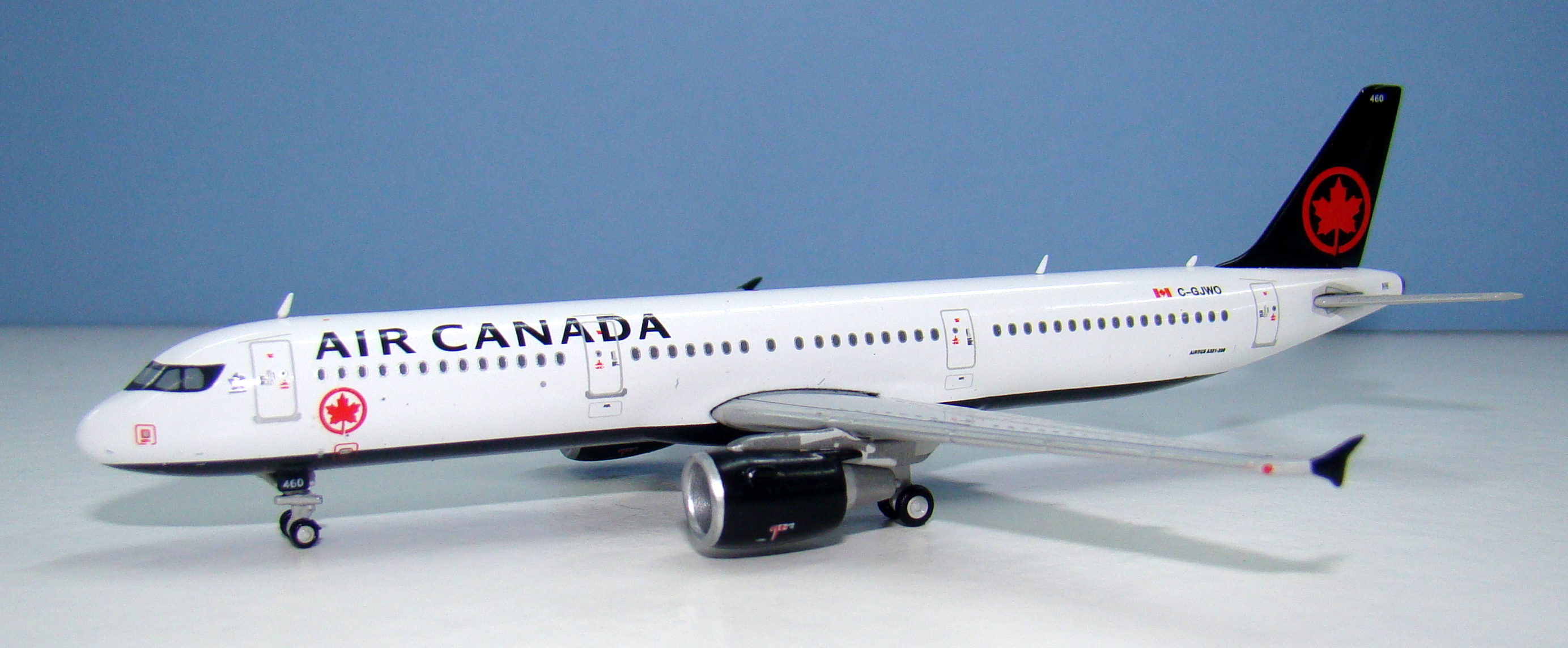
Air Canada has operated an Airbus A320 family fleet since January 1990 and 37 A320s still remain in service, only 8 of which are actually newer than 1993 build. That means the majority of Air Canada’s A320s are over 27 years old and I assume will be replaced shortly by new 737 MAX-8s. In addition the fleet also has 17 newer A319s and 15 A321s within it (a further 20 A319s and 5 A321s serve with Air Canada Rouge). The A321s date mainly from 2001-2003 aside from four ex Air France aircraft, three of which are much younger. The A321s seat 14 business class seats and 169 economy class seats and are heavily used on domestic trunk routes and cross border services.
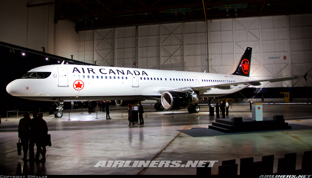
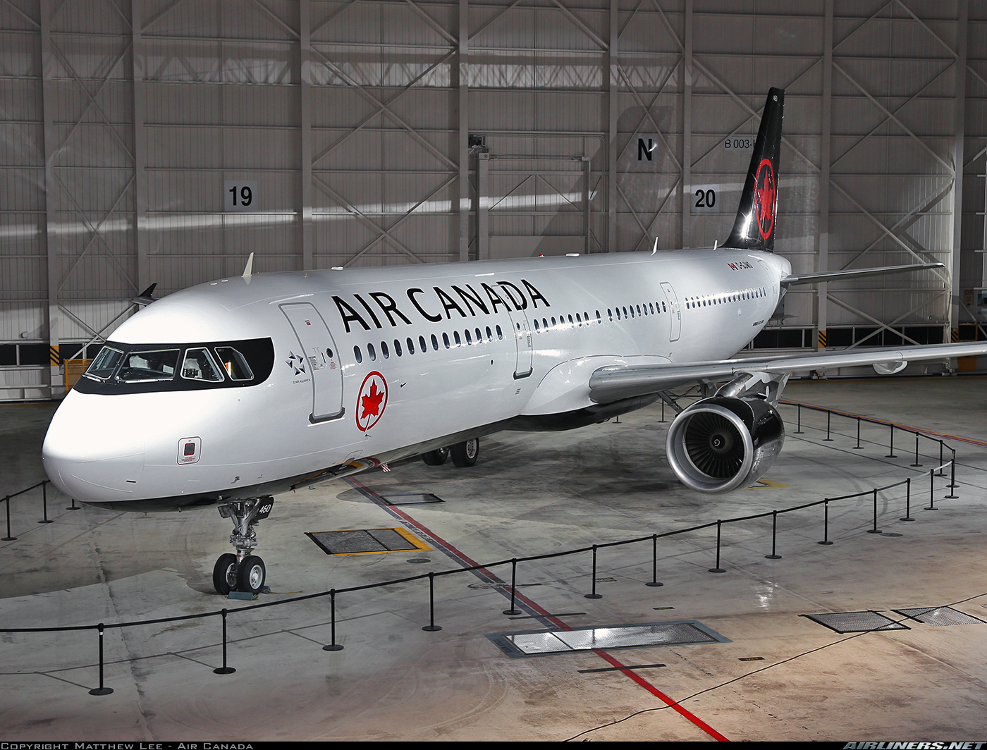
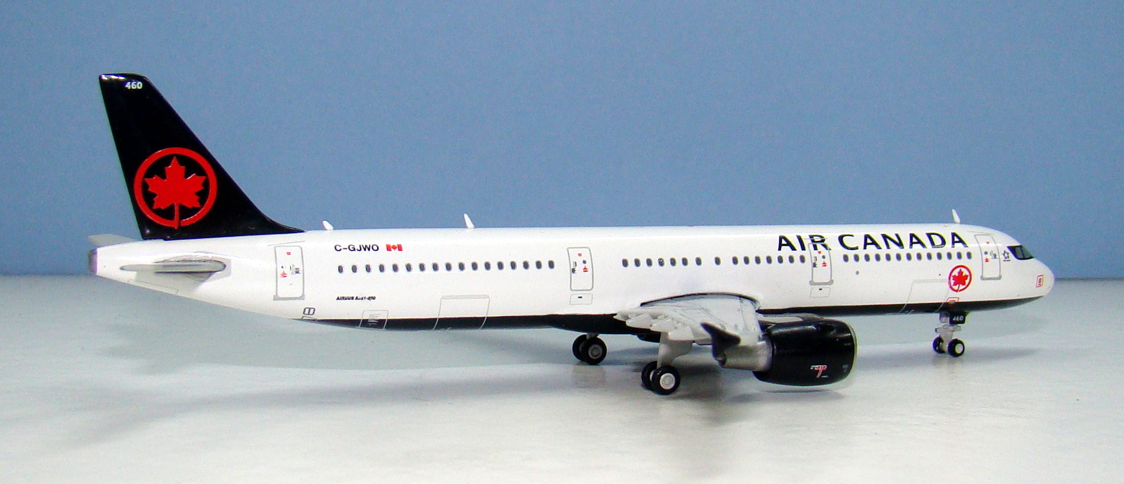
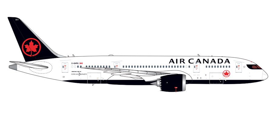
Air Canada unveiled its new livery on February 9, 2017 in a simultaneous triple event at Toronto, Montreal and Vancouver. This involved three aircraft being repainted in readiness and aside from the new 787-8 C-GHPQ also included a pair of A321s (C-GJWI and GJWO). The new livery was designed by a design firm called Winkreative headed by the Canadian entrepreneur Tyler Brûlé. It was unveiled to mark the occasion of Canada’s 150th anniversary year and ‘represents the strength of our nation and the future-looking spirit of our airline‘.
Read more about the new livery from Air Canada’s press release.
THE MODEL
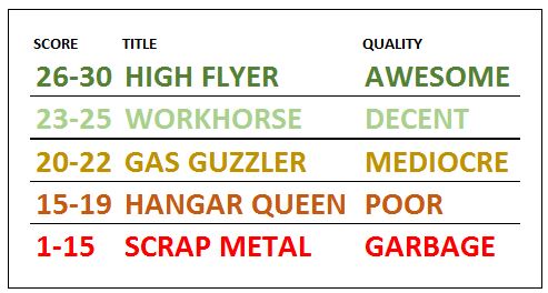
The format for my reviews is to split them into three key areas:
- The mould of the aircraft
- The paint and livery
- Printing and quality control
Each can get a maximum score of 10 for a section giving a maximum combined total score of 30.
THE MOULD
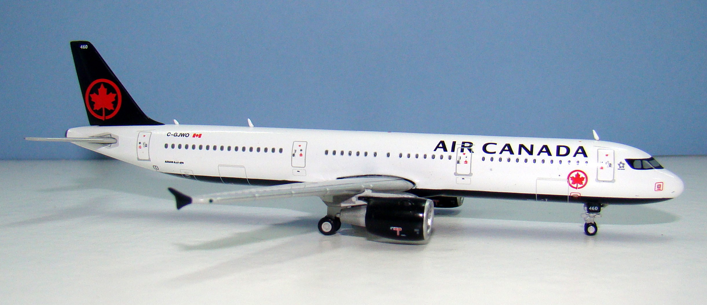
JC Wings have a new A320 family moulding set for the A320ceo, A320neo and A321 (but not yet the A319). It arrived in late 2016 and initially looked better than the previous cradle mould, which had a large seam. This means that all three types will share the same features across the majority of the mould for better or worse.
As I reported with the LATAM A320neo the mould is not the world beater we’d hoped for and in several ways is inferior to its predecessor. It is certainly not a total loss however and with the A321 actually looks better than the A320 due to the type’s extra length.
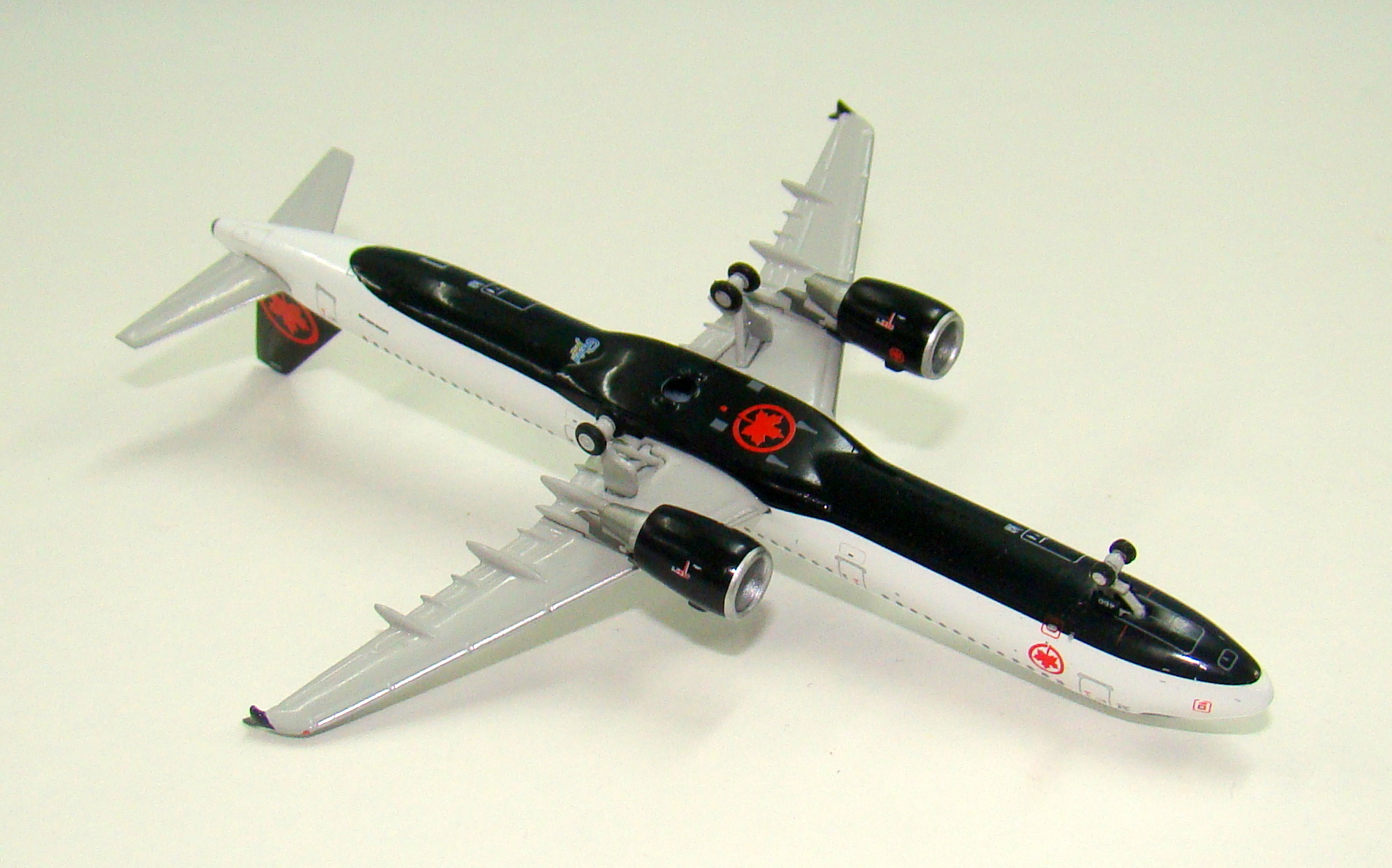
As with the neo the tailcone is not correct, it’s too short and thick at the cone. The model also is missing the underside antenna and the first antenna is too large, both common with a lot of JC Wings moulds. In comparison to the LATAM the nosecone actually looks better formed on this A321 but the nosegear position and design is still a mess. The gear leg is noticeably too far back, too straight and very chunky. The old JC Wings A320 had a simple stalk style nosegear but it at least was in the correct position and not tree trunk thick. This is for me the biggest issue with this mould but I have to admit it doesn’t look awful, perhaps hidden a bit by how nice this livery is? Nonetheless the gear leg on an A320/321 simply doesn’t look like the way it has been realised on the model.
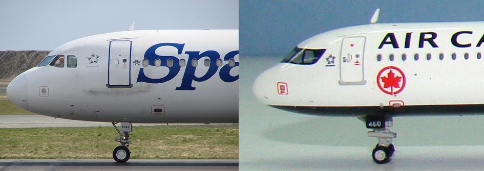
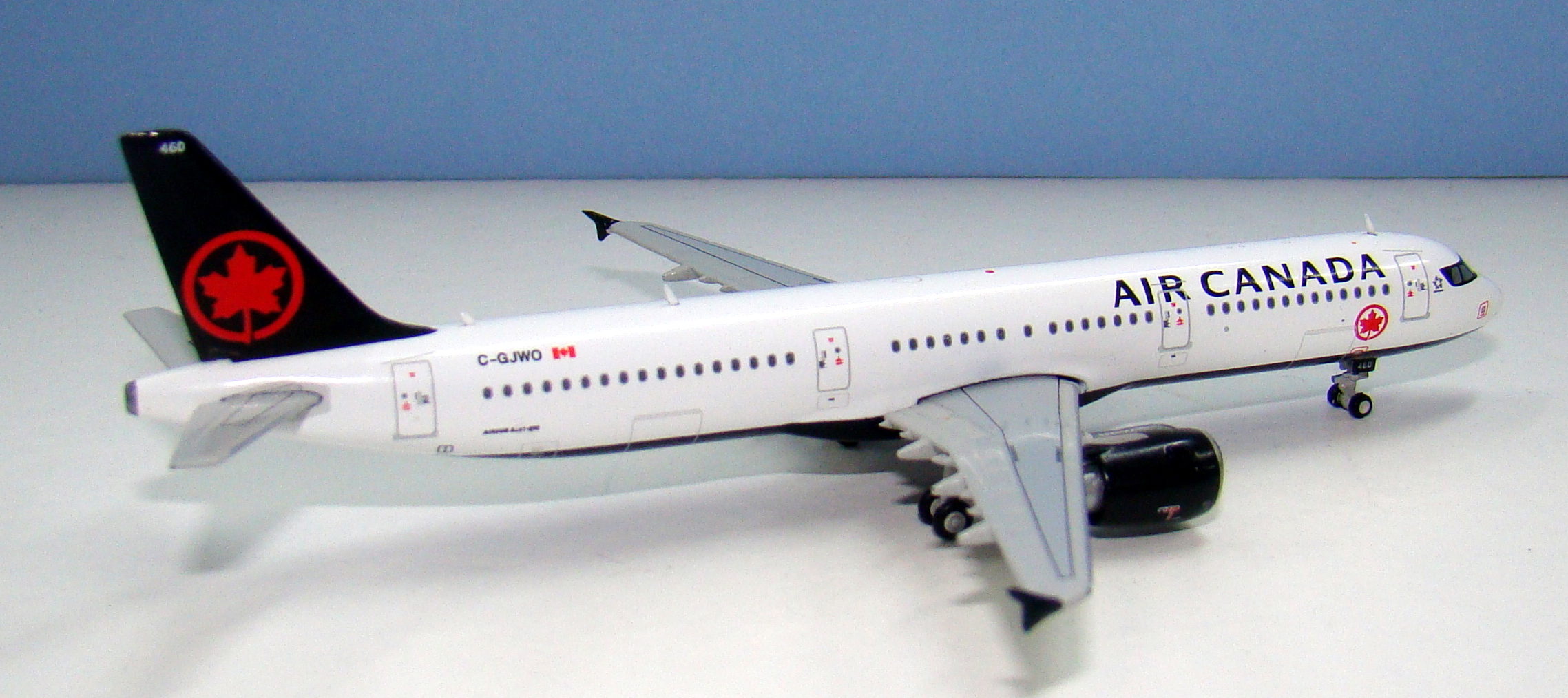
Onto the good parts and as this is a ceo it doesn’t have the awful chunky great engines that the LATAM model had. The engines themselves look fine (the fan colour is another matter) whilst the wings are a mould strongpoint. The wings of an A320 and an A321 are not the same. The A321 has double slotted flaps which mean there are more flap track fairings on the rear of the wing. In detail you can see the extra spiky bits between the 3 large fairings. Phoenix never seemed to have noticed this and used an A320 wing on all their A321s. I am pleased to say that JC Wings have got the wing correct and it is really nicely done.
If it wasn’t for the nosegear this mould would score highly, however it really sticks out for me. Even so this is a better mould than the two A320 variants. It’s certainly inferior to the Aeroclassics A321 but probably on par with the Phoenix mould, which has its own issues.
SCORE – 7
PAINT & LIVERY
I have read a few responses mourning the previous arctic blue / toothpaste livery but I am not amongst the mourners. I always found it to be a bland livery that couldn’t decide what it wanted to be. The new livery for me is a lot bolder and classic with the new roundel and eye mask being dynamic and interesting. I admit I’d have liked less white fuselage but overall I find the new scheme both stylish and attractive. Air Canada say the livery has a
“bold black and white design that highlights its iconic red maple leaf encircled ensign, or “rondelle,” that returns to the tail of the flag carrier’s fleet after an absence of 24 years.”
Despite the flourishes it is still a simple livery and yet so far at least two of the manufacturers that have tried it have got it incorrect. Aeroclassics used the incorrect font on the titles and the eye mask looked wrong, whilst Phoenix somehow used blue rather than black!
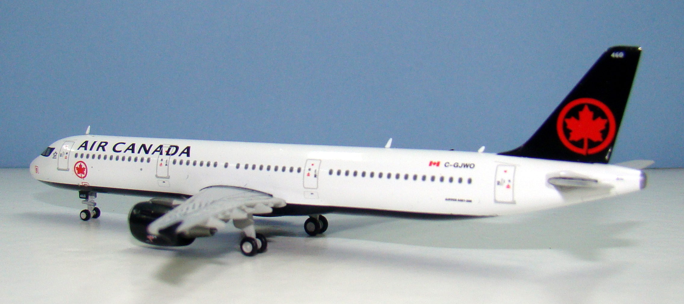
Ok so the model is black and white but the red colour is just not correct. Even outside of the bright lights of the unveiling ceremony the red colour should be bright red not a dark red, yet dark red is what Gemini have given us. It’s wrong.
I can see that the cockpit mask is going to be a challenge for the manufacturers with their atrocious eye for detail. Aeroclassics already mucked it up and Gemini come close too as the larger side cockpit window only just fits inside the mask. There isn’t enough width between the window and edge of the mask but otherwise the shape of the mask is fine. The Star Alliance logo is a fraction too low but that’s very minor. The rest of the livery is spot on position wise. The fleet number (so characteristic of AC planes) is on the tail and nosegear and the title font is spot on.
I’m only knocking points off here for the red colour as it is way off.
SCORE – 8
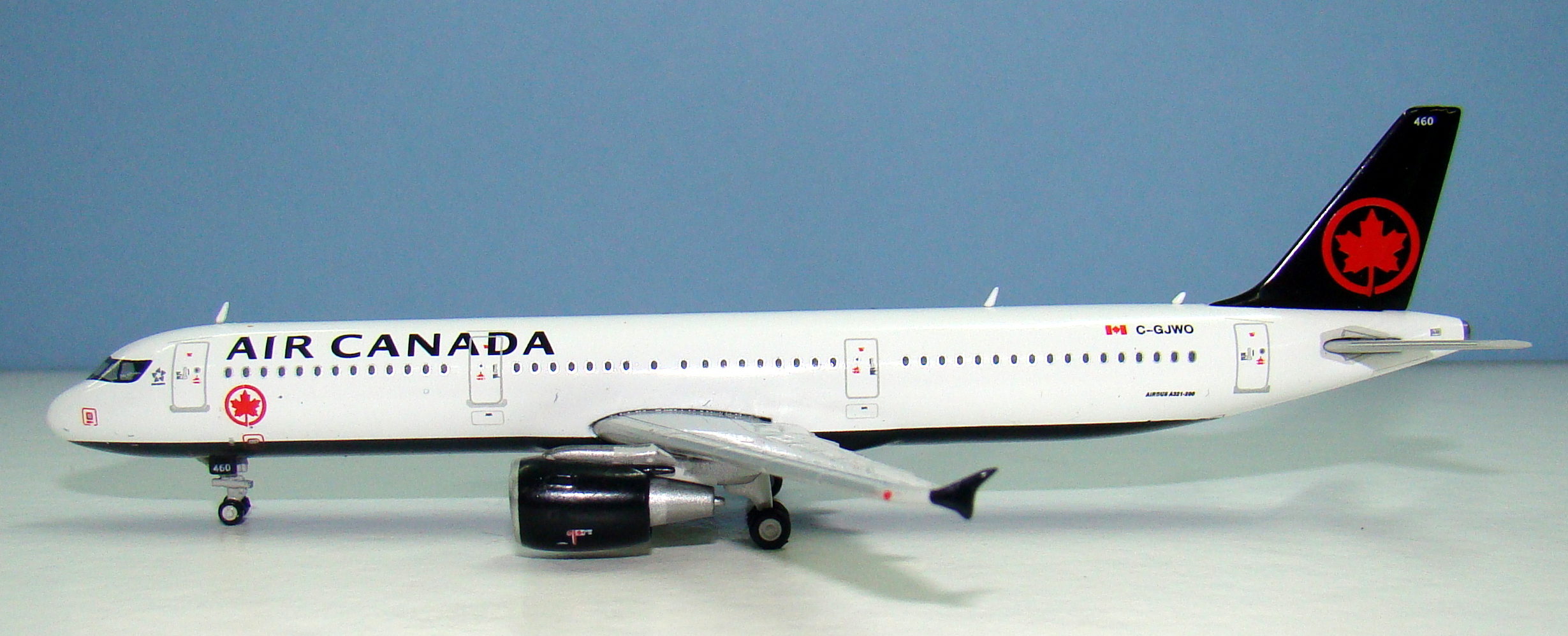
PRINTING & QUALITY CONTROL
I do enjoy the printing quality of Gemini’s models and as long as they get the details of the livery correct the printing is usually great. It certainly is on this model. There’s lots of little detail especially in relation to the belly cargo doors and engines. Unfortunately JC Wings seem to have unlearnt that the fan blades on real aircraft aren’t silver.
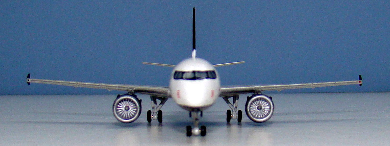
Quality wise and the model looks very good too. Everything is attached correctly though I do note that the fit of the wings to the fuselage isn’t as tight as I’d like. There is a thin but noticeable gap between the two along the wingtop. Still that is a minor complaint about a superbly put together model.
SCORE – 8
CONCLUSION
I like this livery a lot and I’m ok with the new A321 mould even if I wish they’d do something about the nosegear. It’s a shame that the red is so far off and the fanblades silver. Even with its faults this is a fine model and probably about as good as we can seemingly expect from the 1/400 manufacturers in 2017.
FINAL SCORE – 23/30
Considering AeroClassics fixed the “Air Canada” fonts after their first A321, they have released since, near perfect A320, A321, & A330.
The antennas on this model are an eyesore; out of scale, and just a gimmick for this scale!!
Thanks for a very insightful review. I’m a casual collector, and this one is going into my small arsenal for sure. Not a stickler like some, but I certainly appreciate the attention to small details’ accuracies/inaccuracies by some reviewers like yourself.
cheers